Report Builder—a tool to automate report generation
UX Research
Testing
UI Design
Fanny Vassilatos
Company
SweetIQ
Every month, our account management team used to manually build and send out monthly reports to all our clients.
Those reports needed to be highly customized for each client. Account managers ended up having to screenshot the dashboard’s charts, generate graphs manually in a separate spreadsheet or even have developers run scripts with the data to generate the infamous reports. Overall, this represented more than 30 wasted hours and way too much frustration every month.
60 minutes
time it used to take to produce one report
50 hours
over one month
600 hours
over one year
That's how the Design Team got to create a report builder that could automate this process and make the accounts team's life easier.
Mapping the original experience
Since the end-users for this project were my coworkers, it was easy to start by mapping what they were currently doing. I wanted to know all the different steps of their process, the different software they were using, where the pain points were and what ideas they had.
Account managers used to screenshot graphs, generate new charts in spreadsheets, assemble everything manually in a deck of slides, send via email and schedule conference calls to walk clients through the report.

Affinity mapping
We started by getting some account managers and stakeholders in a room to brainstorm their ideal report generation process. We gave them a bunch of post its and told them to dream big. This "feel the burn" session was eye opening and resulted in affinitive words and phrases which allowed us to quickly highlight the key requirements for this new tool.
Wireframing
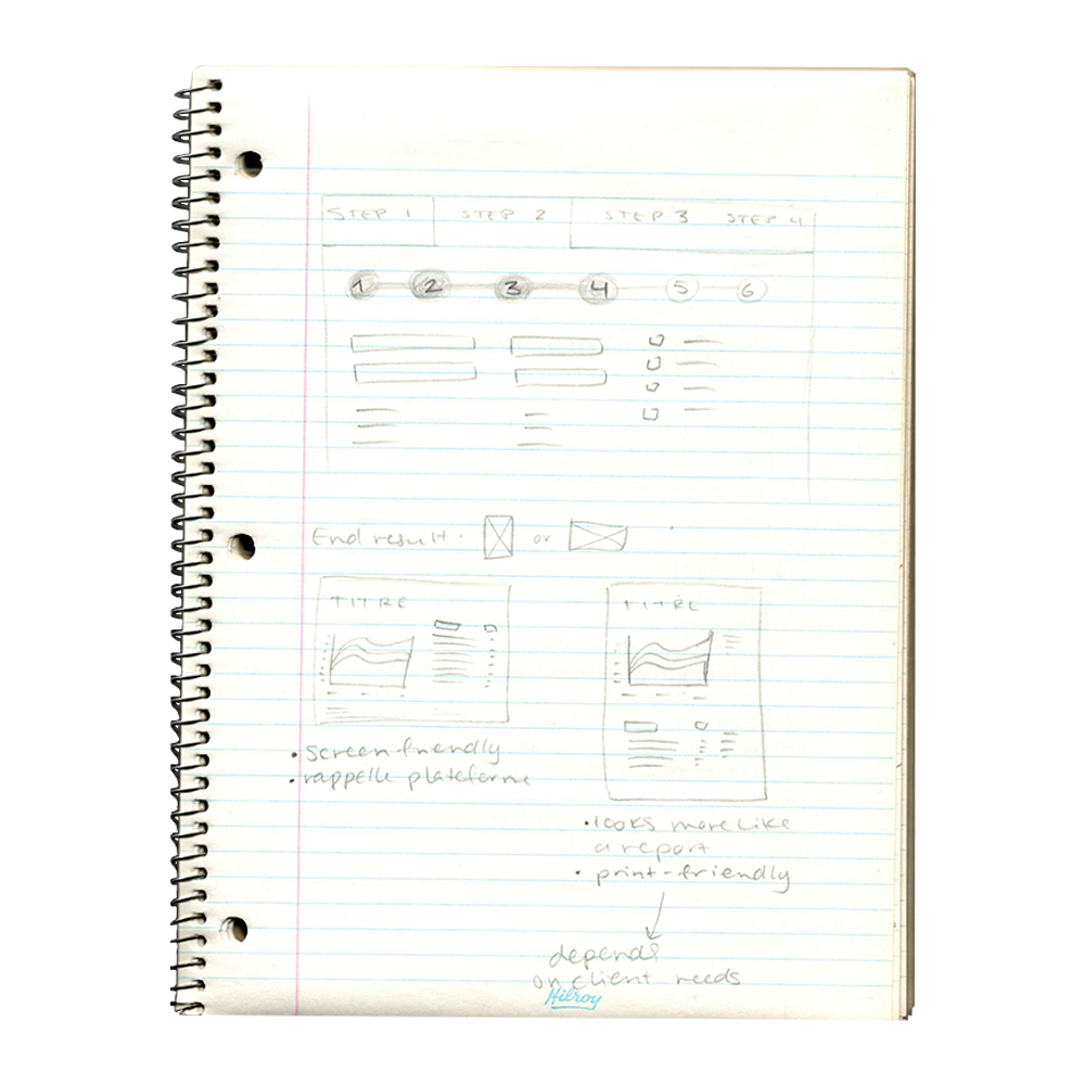
With some guidelines in mind, I could start exploring different proposals as to how this tool could be structured. There were some bad ones, some good. We finally went for a presentation-slides type of page-by-page editor.

High fidelity design + prototyping
Once we'd settle on to an idea, I jumped right into high resolution mockups, hotspotting each version as a prototype when I completed one whole user flow.
This step included the redesign of the outcome exported PDF, which had to support 3 versions (whitelabel, SweetIQ branded and client branded). I worked on a template file that could work with all 3 formulas and redesigned some charts and graphs that needed a fresh new look.
Edit card Reports can be customized with a note to accompany graphs that can show confusing or unexpected data.

Filter sidebar We included a powerful filtering feature that allowed to populate all charts and graphs of the report with the most relevant data for that client.
Live preview We allowed users to preview the final PDF before exporting.
Usability tests
Individual
While iterating on that high-fidelity prototype, I shared the link around, went up to account managers' desks and made them play with the latest version. Gathering impressions and feedback along the way helped me clean up the product, remove unnecessary functionalities, and perfect the most central ones.
Lesson learned
Here, I learned that for non-designers, interacting with a prototype that's so close to reality makes them focus on the details waaaay too much. They were reading every bit of copy, wondered why this data seemed off or why they couldn't type in that field.
Group
Once we had reached a viable solution, we worked with our developers to build a first working version. On the first day of launch, we sat 10 members from the customer success and support teams in our Creative Lab and logged them on to our Beta.
It was that time of the month where report generation was a priority task for their department. Our product manager was ready to watch them go, actively noting down what went wrong in terms of interaction as well as data accuracy.
Conclusion
The first reactions were great. People were surprised at how fast it was to generate a new report from scratch, compared to what they were used to do. It made the task more fun—and the reports prettier.
With the feedback we got, we made sure not to develop unnecessary features, reviewed the requirements and ended up launching in prod, opening up to the entire company.
20 minutes
time it takes to produce one report with new builder tool
17 hours
over one month
204 hours
over one year
66%
reduction achieved
For me, the biggest learning in this project is that every problem is worth solving. Even projects that aren't client-facing. When you work internally, it might be trickier to perceive the value you bring to the company in terms of sales or customer success. However, making your colleagues' jobs easier is 100% worth the effort. I'm glad I got to discover that with a successful project.