Pencil & Paper Labs —creating educational resources around enterprise UX
Collaborator
Ceara Crawshaw
Pencil & Paper
2020 → Ongoing
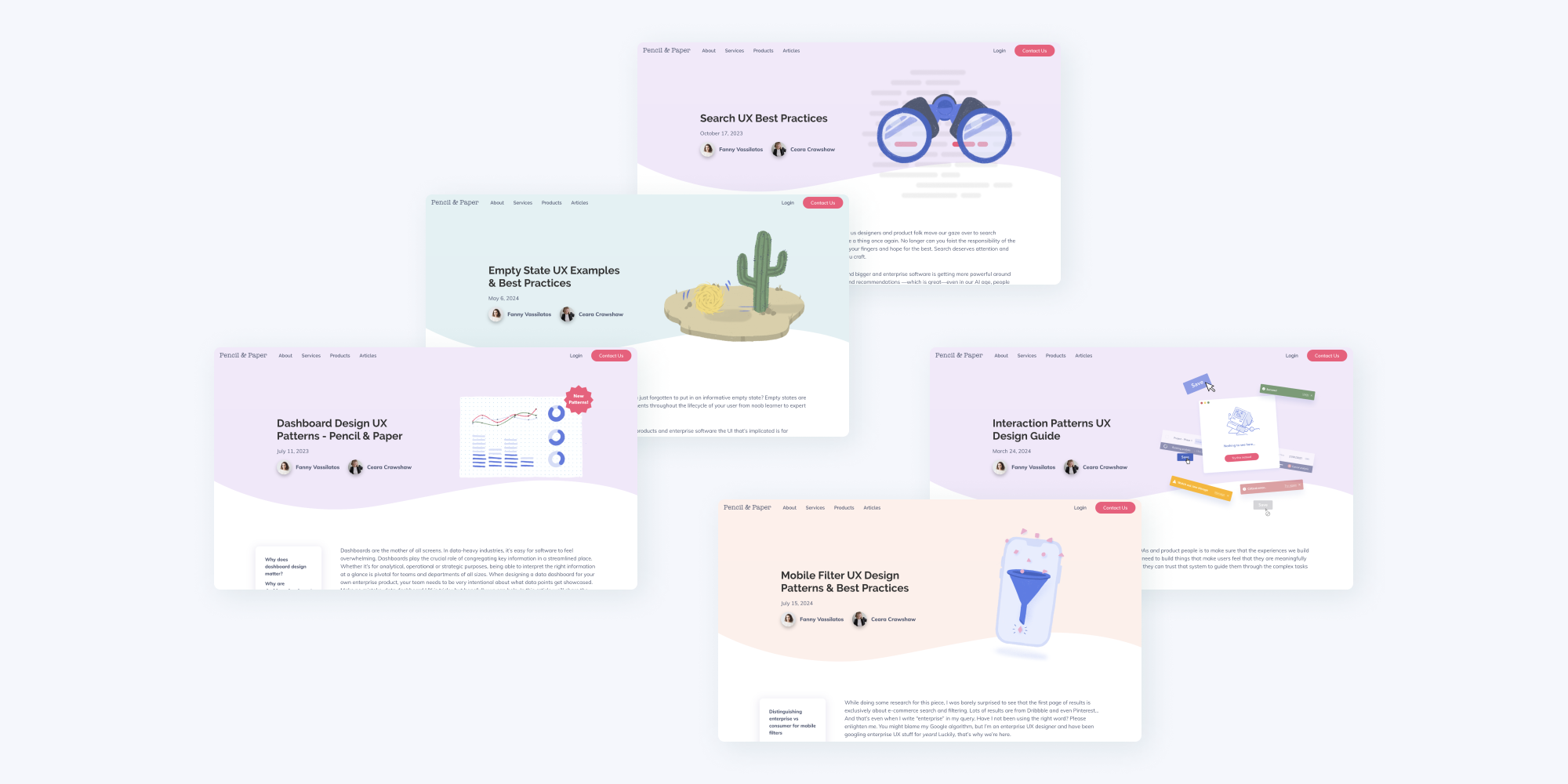
Beyond client work, a core part of my collaboration with the Pencil & Paper studio is contributing to Pencil & Paper Labs, the studio's parallel educational and content effort. We quickly found there was a need for enterprise-oriented UX resources out there and set out to build a library of articles, templates and tools that addressed more complex use-cases than your typical consumer software UX and with a buuuunch of visual examples.
tl;dr
In a nutshell, Ceara (the CEO of Pencil & Paper) and I shared the experience of struggling to find interaction examples for the types of enterprise projects we had been working on.
We started cathartically extracting everything from our brains about a particular UX pattern at a time, and shaped that into a series of 3K+ word articles filled with visual examples.
This quickly struck a chord with our audience and ended up regularly bringing tens of thousands of people to the website, enterprise designers just like us but from cool brands like Samsung, Bosch, J.P.Morgan, BP, Dell and many more. #proud
Browse Pencil & Paper articles here
I’d be so curious to see which types of dashboards and data tables and search experiences these designers are working on internally 👀
How it all started
As soon as we met, Ceara, the CEO of Pencil & Paper, was excited about my interest in writing. Early in our collaboration, she challenged me to write an article about data tables. I started a new Google Doc and next thing I knew I was 4000 words in. This was the start of a whole series of articles, webinars and digital products around Enterprise UX Patterns.
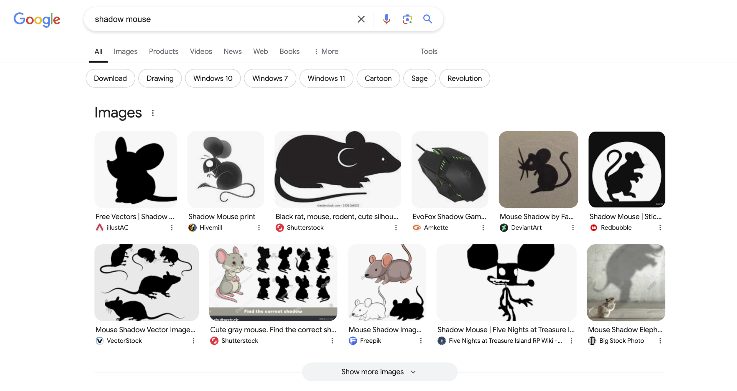
Our main motivator was that we all shared the frustrating experience of not being able to google UX patterns and examples for the kinds of projects we were working on. Most of the UX content out there talks about consumer apps and commercial usecases. If you search for "filtering UX pattern" you get disproportionately more results around e-commerce use cases. But that kind of documentation is useless to enterprise designers like us. Filtering on an online store to find "red shoes" is a completely different experience to that of filtering through large datasets using various ranges and complex user-generated variables in a niche internal portal.
An example I came across recently, trying to look up inspiration for how to handle hover tooltips in a shadow cursor context… I think this sums it up pretty nicely
As irritating as this phenomenon is for designers trying to look up inspiration for their enterprise interactions, it also makes sense. The enterprise software world is a pretty gated one. We're talking about products that people use internally, or specialized tools that handle sensitive data. Sharing these artifacts as-is is simply out of the question for these companies, white-labelling the interfaces is extremely time-consuming (and it's hard to see how a B2B company would benefit from sharing their UX/UI design expertise online), and, most importantly, B2B companies typically don't want to share this kind of intelligence and proprietary solutions to keep their edge in the market. No wonder you can't just browse Dribbble and Pinterest for examples of UIs like these.
Enterprise designers ended up being used to that reality and just had to work without the privilege that B2C designers have to stand on the shoulders of giants. So we set out on a mission to break this culture of gate-keeping, finally put materials out there for all this stuff "you can't just google" and share what we've learned through years of client projects.
Our process
Our writing process typically starts with a collaborative braindump on Whimsical, where we start to sketch out a possible outline for the piece. Then a bunch of research happens to try and glean any enterprise content that might already exist out there (no small feat). As the draft starts taking shape, we identify which areas deserve a visual example (typically a lot). Since we like to get our usecases and examples as specific and realistic as possible, we have to create those assets manually. We've been growing an internal library of interaction examples inspired from our own client work and past experiences. After some rounds of feedback, the article is ready to ship and we announce it in our newsletter.
A scroll-through of our first piece, to show the extent of the visual examples we included to support the text
We often joke that writing these UX pattern analyses is like therapy to us. Getting this material out of our brains is easy and effortless, the anecdotes and “been there done that” just keep coming, and the process of organizing these thoughts into digestible knowledge is quite a cathartic process. We were glad to see this resonating really early on with our audience.
We regularly see our articles getting organically shared around on LinkedIn and X
Our content has evolved to become a suite of free articles and online products like courses, webinars, templates, checklists and whitepapers.
Where we brought Labs
Now, tens of thousands of people around the world read our content. Our articles get organic traction on LinkedIn and X where people praise their accuracy, relevancy and specificity. Our resources get used every day by designers at top companies like Disney, JPMorgan, Government of France, Atlassian, BP, Tesla, Volkswagen, LinkedIn, Bosch, WeWork, Qualtrics, Stripe, Lowes, TD Bank, Samsung, Bank of America, BMO.
The last webinar we ran was about how to run a UX audit and we hosted it live on LinkedIn. We announced it only 2 weeks in advance, had 200 people register and a 25% turnout from more cool brands like Walmart, Shopify, Philips, Pepsico, Allianz, Dell Technologies, Microsoft, Accenture and Scotiabank. (If you’re curious, it's now available as an on-demand product on the Pencil & Paper website.)
I’d be so curious to see which types of dashboards and data tables and search experiences these designers are working on internally 👀


